Here, then There, then COVID’s Everywhere:
The pandemic’s tragic path from cities to farms — and from blue America to red

COVID-19 is sweeping widely through the country. Again. But each wave is hitting different political groups as it infects new areas. In the first part of my analysis of America’s growing political divide, I showed how voters are increasingly polarized by where they live; in the second article, I documented growing geodemographic differences among voter blocks. In this article, I chronicle the pandemic’s spread from urban areas to rural, and from blue regions to red. Population density certainly explains much of the spatial differences, as the virus advances chiefly through social interaction. But politics and social attitudes bear much of the blame for COVID’s greater and more deadly march through red America. Part 3 in an occasional series examining the growing divide between red and blue communities.
We’re now suffering through the third wave of COVID-19 infections, with each progressively worse than the prior. Much worse. This latest surge began in mid-September and within a month rose to new peak levels. The number of cases has shot skyward ever since, setting new daily and weekly records almost every day. Based on data from USA Facts, the seven-day average soared to over 225,000 cases last week, more than three times the summer peak, which itself was more than twice the initial peak (Figure 1).
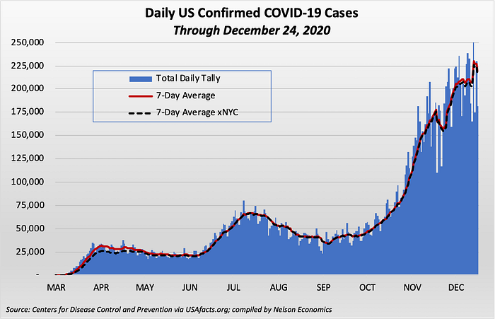
The number of cases has increased by an average of almost 15% PER WEEK for each of the past 14 weeks , though now appears to be cresting again, at least temporarily. More testing alone did not cause that growth. The number of cases has increased by 10% more than the number of tests over this period — which is to say, the test positivity rate has been rising as testing expands. Thus, the greater availability of testing is confirming the pandemic’s growth, not just measuring it more fully.
The death toll has followed a somewhat different — if more horrifying — pattern. The number of deaths in the second wave did not approach that in the first, as doctors learned how to treat the afflicted better. But as cases surged in the third wave, so, too, have COVID-related deaths. The seven-day average is now 16% greater than at the peak of the first wave (the red line in Figure 2).

A disproportionate share of the early deaths was concentrated in New York City. At its peak, NYC accounted for almost a third of all COVID-related deaths in the country, despite having less than 3% of the U.S. population. That’s changed. New York’s share of deaths in the third wave is now close to their population share. Excluding NYC’s deaths, the weekly rate of COVID mortality in the rest of the country is now 64% greater than in the first wave (the black dashed line). This week has seen these deaths spike to over 3,400 per day — virtually all outside NYC.
COVID’s Shifting Geography
COVID-19 initially was almost exclusively concentrated in the most densely populated urban areas, which tend to be Democratic party strongholds. But as the pandemic has ebbed and flowed, it has also increasingly migrated to far-flung, more sparsely populated areas, which tend to vote Republican. In other words, COVID is getting both greener (more rural) and redder (more Republican).
I built upon the political and demographic databases that I compiled for my earlier “Polarized” articles cited above to analyze the pandemic’s migration across the country relative to voting patterns in the 2016 Presidential election per the Harvard Dataverse. The split of infections between red and blue counties now almost exactly mirrors their underlying shares of the population. Republican (red) counties account for about 46% of the current U.S. population, while Democrats (blue) account for the remaining 54% (Figure 3). Similarly, red counties account for 48% of the nation’s coronavirus cases compared to 52% in blue counties.
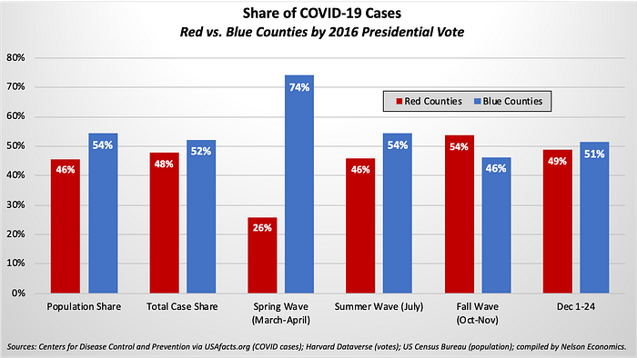
But this overall parity belies dynamic shifts in the share of cases in red versus blue counties. Democratic counties accounted for almost three-quarters of cases in the frightening first weeks of the pandemic. But as the pandemic mushroomed and dispersed through the country, both the absolute number and the percent of cases in Republican-voting counties rose steadily to exceed that in blue counties (Figure 4). For example, the red county share rose to 54% of cases in October and November but dipped to just under half this month as the virus again spreads widely in some populous blue states.

The pandemic’s relative decline in blue counties and rise in red comports with popular stereotypes about support for public health policies like masking and social distancing among Democratic and Republican voters. But the virus is not just following party affiliations. A primary driver seems to be geographic as the virus seeks fresh human hosts in new territories, and the pandemic increasingly migrates from dense urban areas to more sparsely populated rural areas.
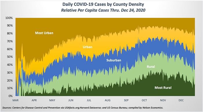
Cases were highly concentrated in the most densely populated counties early on (shown in brown in Figure 5), but the virus quickly took hold in rural and ultimately in very rural communities (the light green and dark green areas, respectively).[*] Only in the last few days has the relative caseload eased in rural counties, but this more reflects the renewed surge in urban areas. The absolute number of cases is still distressingly high throughout much of rural America.
To gauge the magnitude of the shift from urban to rural communities, we can compare each area’s case share to its population share relative to the country: The higher the ratio, the worse the epidemic in that area. An area’s COVID incidence is below average (a good thing!) when its share of cases is less than its population share (values below the dotted horizontal line in Figure 6); an area suffers from above-average COVID incidence when its percent of cases exceeds its population share (values above the line).

During the initial wave in March and April, the most rural counties’ case rate was just one-tenth of its population share (a ratio of 0.1). In sharp contrast, the ratio in the most densely populated counties was 40% greater than its population share (a ratio of 1.4). In other words, the per-capita case rate in big cities was 40% greater than the national average. In fact, the incidence ratio was below 1.0 in all areas of the country except for the big cities, demonstrating the degree of COVID’s early concentration in urban America. However, this ratio was moderately higher with each successive increase in county density.
Six months later, the trend has fully reversed: The relative caseload in very rural counties now is almost twice their population share (a ratio of 1.8), and this ratio declines steadily with density. The highly urban county group now is the only area with below-average cases.[†] The case ratio in these most densely populated counties is now 12% less than its population share.
Red Versus Blue America
How much of a role does politics play in this spread? Epidemiologists and political scientists will no doubt adduce different types of evidence. But this data-driven economist can’t help but notice a remarkably similar pattern in the pandemic’s dispersion when arraying caseload levels against voting patterns.
When cases mostly plagued urban areas during the spring wave, the pandemic was highly underrepresented in red counties and overrepresented in blue (Figure 7). Moreover, the caseload closely correlates with the voting margin, whether blue or red: the larger the vote margin for the Democrat ticket, the greater the per-capita caseload and visa-versa.[‡]
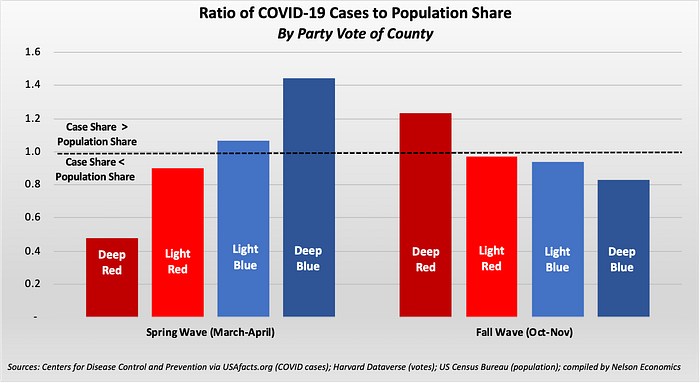
As with the pandemic’s urban to rural migration, the red-blue trend exactly reversed between the spring and fall: Now the relative caseload in the reddest counties exceeds its population share (a ratio of 1.25). In contrast, the bluest counties have below-average caseloads (a ratio of 0.83). While county population density undoubtedly is a factor, it can’t explain everything.
Consider the case rates within the “suburban” counties (medium density). With 40% of U.S. counties, this group presents the best cross-section of voting distributions of any county density type (Table 1). Though there was no discernible pattern in COVID infections by voting affiliation in the spring wave, a clear pattern does emerge in the fall wave as the case rate increases with the Republican vote share.

So, the politics surrounding COVID do matter: Bluer counties, which have been more likely to follow public health guidance, enjoy relatively lower infection rates than redder counties, where there has been more resistance to this guidance. Indeed, this same pattern holds at every density level: redder communities always have higher rates of COVID incidence, whether in big cities or small rural communities.
In sum, both population density and political leanings have furthered the pandemic’s spread. And the consequences have been deadly. Fortunately, the overall death rate has fallen considerably since the beginning of the pandemic. But as with the underlying caseloads, blue and red have communities experienced dramatic reversals (Figure 8). The early COVID-19 deaths occurred almost exclusively in densely populated, Democratic-leading counties, especially the deepest-blue counties. In the fall surge, however, the locus of COVID mortality shifted to more rural Republican territory, and the per-capita death rate declined most significantly in the bluest areas.

Finally, there also has been a comparable reversal in the share of cases in each voting bloc that results in death (Figure 9). The mortality rate was higher in blue counties in the first wave. Though the overall mortality rate fell as we learned how to treat the virus, blue counties have seen much more significant declines than red counties and now have lower mortality rates. Large urban areas plainly benefit from superior medical care compared to what’s generally available small rural communities. But it’s hard to ignore that politics and social attitudes in each region also are decisive.

Hard Political Lessons
The coronavirus has been a plague on our nation’s physical and emotional health. Despite the progress we’ve made in understanding how to curb and treat the disease, COVID-19 continues to sicken and kill more victims as it reaches into new fertile hosts. Since the virus spreads through social interaction, it was inevitable that the nation’s most densely populated communities would be the most vulnerable and would be the first to be ravaged by the epidemic.
Perhaps the spread to less densely populated regions also was inevitable, given COVID-19’s easy transmission — though other countries have been more successful in containing its dispersion across areas. But the tragedy is that the number of cases and deaths in these more rural, more Republican communities could have been far lower if the residents and their leaders understood and respected the painful lessons learned in the denser, bluer areas inflicted by the first wave.
[*] For this analysis I sorted the nation’s counties by population density, from most rural to most urban and then calculated the caseload in each area relative to its population size. Counties were sorted as follows: 10% least densely populated counties = “most rural”; next 20% denser counties = “rural”; “suburban” = middle 40%; next 20% counties = “urban”; and 10% most densely populated counties = “most urban”.
[†] The population density of these urban counties gives them an outsized impact on the national averages. These 315 counties, representing 10% of all counties, account for almost 60% of the nation’s population in less than 5% of the country’s land area.
[‡] I defined highly partisan “deep red” and “deep blue” counties as those with at least a 10% voting margin, while the less partisan “light red” and “light blue” counties as those with less than a 10% voting margin.
